Analytics Case Study 4: BI Dashboard for Executive Revenue Reporting
Industry:
B2B SaaS – The client’s executive leadership team needed a centralized, real-time view of revenue performance across sales, marketing, and customer success. Reporting was fragmented across tools like Salesforce, HubSpot, and spreadsheets, making strategic planning difficult and time-consuming.
Problem:
The client lacked a unified reporting solution that provided an accurate, up-to-date view of revenue metrics. Key issues included:
- Inconsistent data between departments leading to conflicting reports.
- Manual reporting processes that consumed significant time and resources.
- Limited visibility into revenue trends, pipeline health, churn risk, and sales team performance.
- Difficulty aligning leadership on strategic priorities due to unreliable insights.
Solution:
We designed and implemented a Business Intelligence (BI) dashboard using Looker Studio to centralize revenue data and enable real-time, executive-level visibility. The solution included:
- Integrating data sources from Salesforce, HubSpot, and internal revenue systems.
- Defining standardized KPIs for revenue, pipeline, churn, and sales activity.
- Creating an intuitive, role-based dashboard experience for leadership, RevOps, and finance teams.
Execution:
- Requirements Gathering – Interviewed executive stakeholders to define key revenue metrics and reporting needs.
- Data Integration – Connected and harmonized data from Salesforce, HubSpot, and financial systems into a unified warehouse.
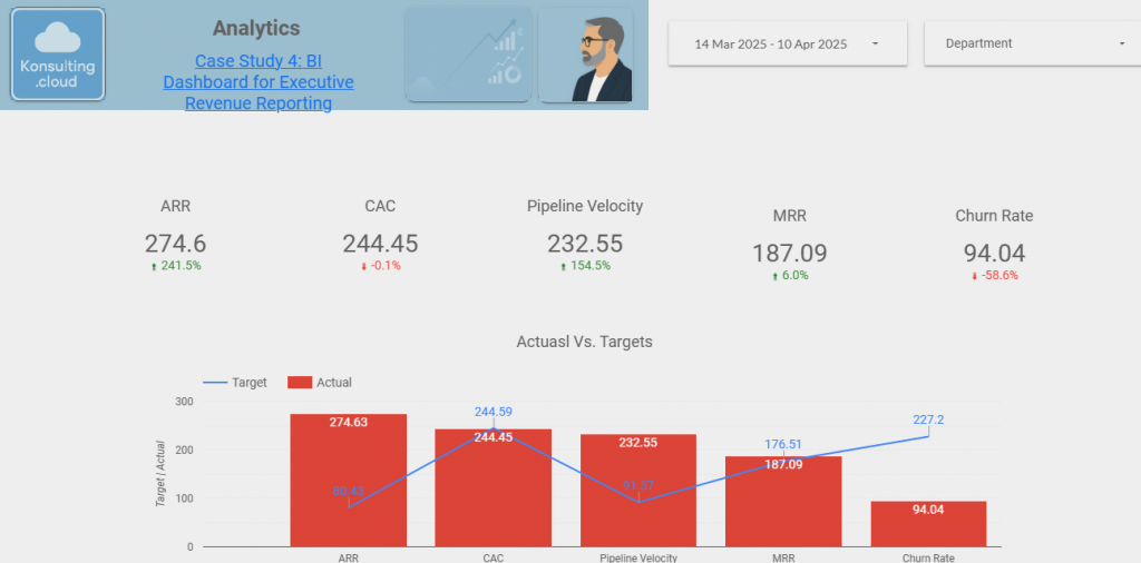
- KPI Definition & Data Modeling – Developed consistent definitions for MRR, ARR, churn rate, pipeline coverage, win rate, and forecast accuracy.
- Dashboard Design – Built custom Looker Studio dashboards segmented by executive, team, and functional views.
- Validation & QA – Conducted data accuracy checks and stakeholder testing to ensure trust in the insights.
- Enablement & Rollout – Trained leadership and RevOps teams on using the dashboard for strategic planning and decision-making.
Challenges & Roadblocks:
- Data Inconsistencies – Reconciled multiple definitions of revenue and pipeline metrics across systems.
- Siloed Ownership – Aligning stakeholders on standardized KPIs required cross-department buy-in.
- Performance Issues – Optimized queries and dashboards for speed and usability, especially for large datasets.
- Adoption Curve – Transitioning from static reports to dynamic dashboards required training and change management.
Results:
- Reduced manual reporting time by over 75%.
- Improved forecasting accuracy by 30%, enabling better strategic planning.
- Increased executive alignment with consistent, real-time insights across the organization.
- Created a single source of truth for revenue, pipeline, and customer health metrics.
Dashboard:
Key Takeaways & Learnings:
Cross-functional collaboration ensures dashboards reflect the needs of all stakeholders and drive adoption.
Centralized BI dashboards empower leadership with real-time, actionable insights.
Standardizing KPIs across teams is essential to building trust in analytics.
Automation eliminates reporting bottlenecks, allowing teams to focus on strategy.
Related Strategy Work:
Business Analysis Case Study 4: Defining KPIs & Reporting Framework for Executive Dashboards